

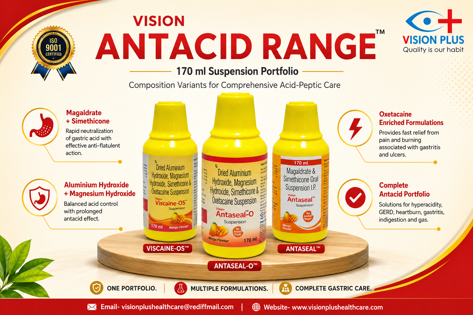
The Science Behind the Pack: The Story Behind a Recognizable Pharmaceutical Packaging Identity
The packaging of VISION ANTASEAL-O, VISION ANTASEAL, and VISION VISCAINE-OS demonstrates how colour, form, functionality, and visual consistency can work together to create a recognizable pharmaceutical identity. Three individual brands. A shared design philosophy. A packaging identity built around recognition, functionality, and consistency.

vision-plus
admin@visionplushealthcare.com
When we look at a pharmaceutical product, the first thing we notice is often the packaging.
The colour of the bottle. The shape of the cap. The design of the label. The way the product looks on a shelf.
These details may appear simple, but pharmaceutical packaging involves much more than visual design. Every element contributes to how a product is identified, handled, stored, presented, and remembered.
This philosophy is reflected in the packaging identity shared by three distinct brands:
VISION ANTASEAL-O
VISION ANTASEAL
VISION VISCAINE-OS
Although each brand has its own formulation and purpose, they share a common packaging language that creates a consistent and recognizable identity.
Why Packaging Design Matters
A pharmaceutical product can pass through several stages before it reaches the person who ultimately uses it.
At every stage, packaging serves an important purpose.
It helps a product to be:
- Easily recognized
- Clearly identified
- Convenient to handle
- Efficiently organized
- Professionally presented
A well-designed pharmaceutical pack must therefore combine functionality, clarity, usability, and visual identity.
Good packaging is not only about how a product looks. It is about how effectively the design works throughout the product's journey.
The Power of a Consistent Packaging Identity
VISION ANTASEAL-O, VISION ANTASEAL, and VISION VISCAINE-OS are three individual brands, but their shared packaging design creates a recognizable visual connection.
The signature packaging includes elements such as:
- A distinctive yellow-coloured bottle
- A recognizable bell-shaped cap
- A consistent visual appearance
- Clear and structured labeling
- A premium and coordinated presentation
When these elements are used consistently, they create familiarity.
A product can be recognized not only by its name but also by its overall visual identity.
Why Colour Is an Important Design Element
Colour is one of the fastest visual cues people recognize.
A distinctive bottle colour can help create a strong product identity and make a product easier to distinguish in a crowded pharmaceutical environment.
The yellow bottle used across this packaging family creates a consistent visual presence while helping connect the three individual brands through a common design language.
This is an example of how colour can become an important part of pharmaceutical brand recognition.
The Cap: Functionality with a Distinctive Identity
A pharmaceutical cap has an important practical role. It must provide secure closure and allow convenient handling.
However, its shape can also contribute to the overall appearance of the product.
The bell-shaped cap used in this packaging design adds a distinctive visual element to the bottle. Along with the bottle colour and label design, it contributes to a recognizable product silhouette.
Sometimes, even a small design detail can become an important part of a product's identity.
The Importance of Clear Label Design
A pharmaceutical label must communicate essential information clearly.
The product name, composition, dosage information, manufacturing details, and other required information must be presented in a structured and readable manner.
Good label design brings together:
- Information clarity
- Visual hierarchy
- Brand recognition
- Professional presentation
The objective is to make important information easier to locate while maintaining a clean and consistent product appearance.
One Packaging Language. Three Individual Brands.
A common packaging design does not mean that every product needs to look identical.
VISION ANTASEAL-O, VISION ANTASEAL, and VISION VISCAINE-OS each maintain their own individual brand identity.
At the same time, their shared design elements create a connection between them.
This approach creates a balance between:
Individual product identity
and
Consistent brand recognition
It allows each product to stand on its own while contributing to a larger and more recognizable packaging family.
Packaging Is Part of the Complete Product Experience
From the moment a product is received and stored to the moment it is selected, handled, and used, packaging remains an important part of the overall experience.
A thoughtfully designed pharmaceutical pack can make a product:
- Easier to recognize
- Easier to handle
- Easier to identify
- More consistent in presentation
- More memorable over time
This is why packaging deserves the same attention to detail as other aspects of pharmaceutical product development.
The Science Behind the Pack
The packaging of VISION ANTASEAL-O, VISION ANTASEAL, and VISION VISCAINE-OS demonstrates how colour, form, functionality, and visual consistency can work together to create a recognizable pharmaceutical identity.
Three individual brands.
A shared design philosophy.
A packaging identity built around recognition, functionality, and consistency.
Because the science behind pharmaceutical packaging is not simply about putting a product inside a bottle.
It is about designing a complete experience—one that is functional, recognizable, and thoughtfully created from the very first glance.
The next time you look at a pharmaceutical pack, remember: every detail has a purpose.